
The way this 'kerrang' masthead has been slightly covered up by an image shows that the magazine editors are confident enough to know it will still be easily recognised. I think this show the magazine is really popular and has been around for quit a while. I like the way there is an effect in the masthead like bits have been cut out. Also the colour of the masthead, black and white really makes it stand out. Also, it takes up the width of the page. The font used is really bold and catches your eye straight away.

I have used two images of the NME magazine to show how they keep everything about the masthead the same bar the colour. I think this shows how confident the magazine editors are as they know it is that popular and recognisable it doesn't matter if they change the font colour. I like how the masthead is simple but still stands out as it is quit big. Also, on this magazine they hide the masthead a little bit because they are confident it will still be recognised and sell. I think I will use a similar masthead to this but use a more unique font.
1.
 2.
2.
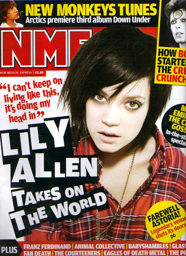
I have decided to analyse these mastheads together, the reason for this is they are very similar to one another. The way both of the mastheads have a filled colour behind the text makes the white masthead stand out. I don't think I will be using a block colour behind my masthead as I think it catches your eye but that it is to plain for the front cover. On the other hand, magazine number one has made the masthead into a splash by placing the masthead a little over the image. While magazine number two has hidden the masthead a little behind the image. Therefore magazine number two is showing confidence as they are sure readers will recognise the magazine like this. I think this looks visually more appealing to the reader as the block colour behind the masthead writing doesn't look to simple.
1.
 2.
2.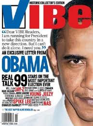
I have used two copies of the VIBE magazine to show the different mastheads they use. The font of the masthead is always kept the same, this could be so the masthead is recognised. On the second VIBE magazine I like how they have used a tick for the V, I think this looks really unique. I like how they are confident changing the colour and style of the font, it shows there magazine is popular.
No comments:
Post a Comment