Tuesday, 30 November 2010
Draft Copy Lesson Two
This lesson I have been working on my draft copy for my magazine, I have been using different fonts and layouts for my writing, I now have a better knowledge of what I want my POP magazine to look like. Also, I have wrote some information of what will be inside the magazine so the reader will have a better idea of what they will be buying. Also, I have chose the price of my magazine which will be £3.00, this is because I want my magazine to look professional.
Draft Copy
This lesson I have been working on fireworks starting my first copy of my front cover. Using different editing tools on fireworks I am testing different things to see what will work on my magazine. Also, checking the sizes of the writing and font to make sure they are in proportion for the magazine size A4.
Thursday, 25 November 2010
Front Cover Layout
I am now going to look at different layouts for my front cover, using fireworks I will try different layouts for the images and information to see which one looks more appealing. I think the layout of the front cover is really important for any magazine as it has to catch the readers eye for them to purchase it. These are some of my initial ideas for my front cover layout. After researching different magazines I have found that front covers that have one image as the background looks more eye-catching and more unique.


After doing draft copies of my front cover layout I have a better idea what looks more eye-catching. The masthead is going to be hidden slightly, this is so the magazine looks more professional and I am confident that the masthead will be recognised. Although I want one main image to focus on that will be the background, I think adding a film stripe of images at the bottom of the page will help the reader and give them a better idea of what is inside the magazine.
Thursday, 18 November 2010
Inspiration Pictures For Front Cover
For my front page I want to use just one image so it is the main focus. I want the shot to be a medium close up. This is so the image catches the readers eye straight away. I want the image to fill most of the front cover so it looks quite intense, but still fits with my theme POP. Below I will put a few images of music magazine images that I like and have took inspiration from for my own magazine.


These are three of my favourite images for a music magazine, mostly because I like the poses each of the celebrities are doing. I think they all catch your eye and stand out because they fill the page. Also, the poses are used for a POP magazine therefore I have been influenced to have my image like these I will now experiment with different camera angles to see which image looks the best for my magazine.
Colour Scheme
This lesson I have been thinking more about my colour scheme. Using colourschemedesign.com has helped me, as I now know what colours work well with eachother and also have a better idea of what colour scheme I want to use for my music magazine.
Wednesday, 17 November 2010
Colour Scheme
Colour Scheme
For my colour scheme I want to make it look bright but still professional throughout the front cover and contents. I want to chose colours that go well together and still fit the target audience of my music magazine. I have used colourschemedesigner.com to help me with my chosen colour scheme.


This lesson I have been testing with different colours to see which one I would like to use for my POP music magazine.
Wednesday, 10 November 2010
Analysing Different Mastheads
I will now research different types of mastheads from popular music magazines, this will then help me to decide what I would like for my own masthead. I think I want to keep my masthead quite simple so it is easily recognised, but I also want my masthead to look unique.

The way this 'kerrang' masthead has been slightly covered up by an image shows that the magazine editors are confident enough to know it will still be easily recognised. I think this show the magazine is really popular and has been around for quit a while. I like the way there is an effect in the masthead like bits have been cut out. Also the colour of the masthead, black and white really makes it stand out. Also, it takes up the width of the page. The font used is really bold and catches your eye straight away.

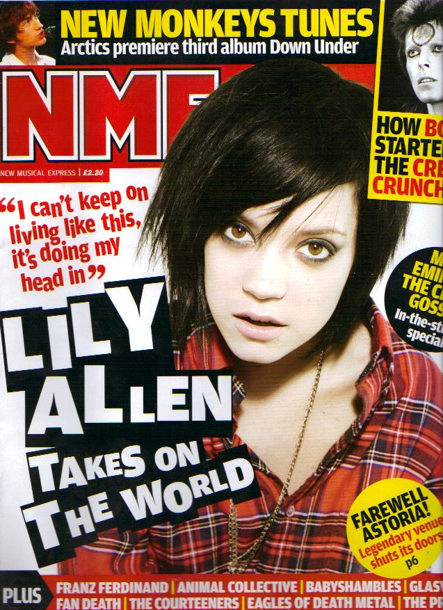
I have used two images of the NME magazine to show how they keep everything about the masthead the same bar the colour. I think this shows how confident the magazine editors are as they know it is that popular and recognisable it doesn't matter if they change the font colour. I like how the masthead is simple but still stands out as it is quit big. Also, on this magazine they hide the masthead a little bit because they are confident it will still be recognised and sell. I think I will use a similar masthead to this but use a more unique font.
1. 2.
2.
I have decided to analyse these mastheads together, the reason for this is they are very similar to one another. The way both of the mastheads have a filled colour behind the text makes the white masthead stand out. I don't think I will be using a block colour behind my masthead as I think it catches your eye but that it is to plain for the front cover. On the other hand, magazine number one has made the masthead into a splash by placing the masthead a little over the image. While magazine number two has hidden the masthead a little behind the image. Therefore magazine number two is showing confidence as they are sure readers will recognise the magazine like this. I think this looks visually more appealing to the reader as the block colour behind the masthead writing doesn't look to simple.
1. 2.
2.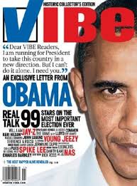
I have used two copies of the VIBE magazine to show the different mastheads they use. The font of the masthead is always kept the same, this could be so the masthead is recognised. On the second VIBE magazine I like how they have used a tick for the V, I think this looks really unique. I like how they are confident changing the colour and style of the font, it shows there magazine is popular.
The way this 'kerrang' masthead has been slightly covered up by an image shows that the magazine editors are confident enough to know it will still be easily recognised. I think this show the magazine is really popular and has been around for quit a while. I like the way there is an effect in the masthead like bits have been cut out. Also the colour of the masthead, black and white really makes it stand out. Also, it takes up the width of the page. The font used is really bold and catches your eye straight away.
I have used two images of the NME magazine to show how they keep everything about the masthead the same bar the colour. I think this shows how confident the magazine editors are as they know it is that popular and recognisable it doesn't matter if they change the font colour. I like how the masthead is simple but still stands out as it is quit big. Also, on this magazine they hide the masthead a little bit because they are confident it will still be recognised and sell. I think I will use a similar masthead to this but use a more unique font.
1.
2.I have decided to analyse these mastheads together, the reason for this is they are very similar to one another. The way both of the mastheads have a filled colour behind the text makes the white masthead stand out. I don't think I will be using a block colour behind my masthead as I think it catches your eye but that it is to plain for the front cover. On the other hand, magazine number one has made the masthead into a splash by placing the masthead a little over the image. While magazine number two has hidden the masthead a little behind the image. Therefore magazine number two is showing confidence as they are sure readers will recognise the magazine like this. I think this looks visually more appealing to the reader as the block colour behind the masthead writing doesn't look to simple.
1.
2.I have used two copies of the VIBE magazine to show the different mastheads they use. The font of the masthead is always kept the same, this could be so the masthead is recognised. On the second VIBE magazine I like how they have used a tick for the V, I think this looks really unique. I like how they are confident changing the colour and style of the font, it shows there magazine is popular.
Wednesday, 3 November 2010
Music Magazine Inspiration
Genres Of Music
-POP
-R’n’B
-Rock
-Indie
-Classical
-Jazz
-Metal
For my music genre I think I would like to use a genre that relates to the music I listen to. Out of the list above my chooses would be out of POP and R’n’B because I enjoy listening to both of these genre.
My chosen genre is going to be POP, I have chose this genre as I think I have more ideas for this and also this is my favourite music genre so I should enjoy creating this magazine.
Names
LOOP
ICE
Co.POPS
CONTINUE
POP LOOK
After having a vote in my class the most popular name was LOOP, I also like this idea so this is going to be my chosen name for my POP magazine, I also like the idea of this name as it is quit different and also easy to remember. I also wanted a short name and this is what I wanted.
Fonts


Masthead
I want my magazine masthead to be simple but still be able to be recognised.

This was my first initial idea for my masthead. I don't think the style of this masthead goes with my colour scheme as the purple lines look to bold with the white. I do think the font works well as my title is LOOP, I will now carry on testing different mastheads to see which ones I like and dislike.
I like how the purple goes really well on top of this masthead, I have used an explanation mark to make the masthead a bit more eye-catching. I think my colour scheme is shown really well with these colours, Although I like this masthead I will not be using it as my final magazine masthead as I think it is a little to dark for my POP magazine.
I think the colour scheme has worked really well, I think it looks brighter with the lighter purple at the back and the writing really stand out on top of the purple. I have used a full stop at the end of my writing, I thought this looked quit distinctive and may be recognised with something more different.
Subscribe to:
Comments (Atom)